a watchdog script tasked with reading and parsing the data,
inputting it into the DEF model, and using the DEF’s classifica-
tion to issue specific commands via the internet to the printer
for corrective actions (e.g., move extruder head, pause job,
cancel job, change flow rate, change bed temperature, etc.).
This script’s efficiency was critical, as it must not hinder the
overall timeliness of the process. Additionally, the cloud hosted
a live dashboard for user monitoring of the print’s current state
and model updates, as well as a database of signals. Feedback
from the watchdog was communicated to the printer con-
troller, facilitating real-time corrections in the online pipeline
and ensuring consistent quality and accuracy in the printing
process.
Throughput and latency are critical metrics in assess-
ing the performance of a system used for real-time analysis.
Throughput, defined as the rate at which a system can
transfer data or perform operations within a given time
period, measures the capacity of a system to accomplish
work in a unit of time. It is typically quantified in opera-
tions per second (OPS). In the context of the digital thread,
the measured throughput was ~34.19 requests per second.
Latency refers to the time taken for a single unit of data or
a request to travel from the sender to the receiver and back.
Also known as response time, it represents the delay or
waiting period between initiating an action and receiving a
response. Latency is usually measured in milliseconds (ms)
or seconds (s). In this study, the digital thread latency was
measured at 0.029 s. Furthermore, lag time can be calculated
to better understand the system’s performance. Lag time is
the total delay between when data is collected and when a
system issues a correction or response. It includes both the
inherent processing time (latency) and the time taken to
handle a request under the current system load (derived from
throughput). Lag time is calculated by adding the latency
to the time required to process one request (the reciprocal
of the throughput). As such, the lag time for this test was
0.058 s. This efficiency is vital for real-time defect detection
and correction, making the system well-suited for fast-paced
monitoring and corrective scenarios. These figures corre-
spond to a measured in-line correction that is ~1 to 2 orders
of magnitude faster than the per-frame acquisition cadence,
demonstrating the throughput benefit of in-process detection
over post-print reprinting.
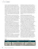
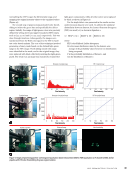
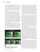
During the live test, the 3D printer operated layer by layer.
As depicted in Figure 10c, the DEF model successfully detected
the type of defect (validated by the visual onset of the defect
layer) and initiated the corresponding correction (change in
flow rate). This real-time intervention was a crucial aspect of
the AM digital thread, illustrating the system’s ability to adapt
and rectify issues as they arose. Figure 10c provides a com-
parative photo of the impact of this technology. The original
part is displayed on the right, featuring a large defect layer that
occurred in the middle of the print. In contrast, the left side
shows the corrected print, where the AM digital thread inter-
vened early to fix the defect before it could propagate further.
This proactive approach to defect management offered signif-
icant time savings in the overall print process. Traditionally, a
defect might only be discovered after the completion of a 1.5 h
print, necessitating a reprint and thus incurring substantial
delays. However, with the implementation of the data-driven
system, defects were automatically detected and corrected in
real time. This not only reduced downtime by several hours
but also facilitated remote monitoring, minimizing the need for
human intervention in the closed-loop system.
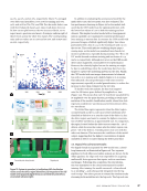
Data visualization plays a crucial role in real-time monitor-
ing systems, as evidenced by its implementation in the digital
thread framework. The benefits of data visualization during
live system acquisition include improved error detection, faster
response times, and the ability to discern patterns and trends
that would be difficult to identify through raw data alone. In
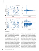
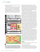
this context, Figure 11a illustrates the visualization capabilities
at the edge and fog levels, facilitated by the commercial AE
software used. This software enables the creation of custom
plots and live data feeds, presented through a user-friendly
dashboard. The edge component of the visualization focused
on waveform features plotted against time. Specifically, the
lower left section of Figure 11a displayed the amplitude of each
waveform over time, while the lower right section showed the
live, updating raw waveform. This immediate data representa-
tion at the edge level enabled prompt detection and waveform
feature analysis.
The fog visualization, on the other hand, extended the
capabilities of the AE software. Specifically, it involved relaying
classification data regarding the type of defect detected by the
fog node. A custom plot was created to display this specific
parameter, enabling end users to easily understand the type
of defect identified. This process involved processing the raw
waveform with a DEF model at the fog node, followed by data
storage in a SQLite database. SQLite is a lightweight, file-based
database management system that provides a self-contained,
serverless solution for data storage. It is widely used due to its
simplicity and cross-platform compatibility. The dashboard
then accessed this file to present live plots from both the edge
and fog nodes. Visualization was an important element of
the AM digital thread. It not only simplifies understanding
complex data but also bridges the gap between data collec-
tion and decision-making. By converting numerical data into
graphical formats, visualization tools enable quicker identifica-
tion of key insights, facilitating more timely decisions. This is
especially critical in systems where real-time monitoring and
immediate response are essential.
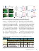
The integration of data visualization at the cloud level in
the digital thread framework was facilitated by hosting the
dashboard on OctoPrint’s cloud server. The dashboard pre-
sented on OctoPrint’s cloud server is shown in Figure 11b. It
displayed print parameters, a live camera feed, printer control
options, and detailed information regarding the print G-code.
This extensive dataset provided users with a holistic view of
the printing process. One of the most notable features of this
system was the live stream of the 3D printing process. This
ME
|
DIGITALTHREAD
48
M AT E R I A L S E V A L U AT I O N • J U LY 2 0 2 6
inputting it into the DEF model, and using the DEF’s classifica-
tion to issue specific commands via the internet to the printer
for corrective actions (e.g., move extruder head, pause job,
cancel job, change flow rate, change bed temperature, etc.).
This script’s efficiency was critical, as it must not hinder the
overall timeliness of the process. Additionally, the cloud hosted
a live dashboard for user monitoring of the print’s current state
and model updates, as well as a database of signals. Feedback
from the watchdog was communicated to the printer con-
troller, facilitating real-time corrections in the online pipeline
and ensuring consistent quality and accuracy in the printing
process.
Throughput and latency are critical metrics in assess-
ing the performance of a system used for real-time analysis.
Throughput, defined as the rate at which a system can
transfer data or perform operations within a given time
period, measures the capacity of a system to accomplish
work in a unit of time. It is typically quantified in opera-
tions per second (OPS). In the context of the digital thread,
the measured throughput was ~34.19 requests per second.
Latency refers to the time taken for a single unit of data or
a request to travel from the sender to the receiver and back.
Also known as response time, it represents the delay or
waiting period between initiating an action and receiving a
response. Latency is usually measured in milliseconds (ms)
or seconds (s). In this study, the digital thread latency was
measured at 0.029 s. Furthermore, lag time can be calculated
to better understand the system’s performance. Lag time is
the total delay between when data is collected and when a
system issues a correction or response. It includes both the
inherent processing time (latency) and the time taken to
handle a request under the current system load (derived from
throughput). Lag time is calculated by adding the latency
to the time required to process one request (the reciprocal
of the throughput). As such, the lag time for this test was
0.058 s. This efficiency is vital for real-time defect detection
and correction, making the system well-suited for fast-paced
monitoring and corrective scenarios. These figures corre-
spond to a measured in-line correction that is ~1 to 2 orders
of magnitude faster than the per-frame acquisition cadence,
demonstrating the throughput benefit of in-process detection
over post-print reprinting.
During the live test, the 3D printer operated layer by layer.
As depicted in Figure 10c, the DEF model successfully detected
the type of defect (validated by the visual onset of the defect
layer) and initiated the corresponding correction (change in
flow rate). This real-time intervention was a crucial aspect of
the AM digital thread, illustrating the system’s ability to adapt
and rectify issues as they arose. Figure 10c provides a com-
parative photo of the impact of this technology. The original
part is displayed on the right, featuring a large defect layer that
occurred in the middle of the print. In contrast, the left side
shows the corrected print, where the AM digital thread inter-
vened early to fix the defect before it could propagate further.
This proactive approach to defect management offered signif-
icant time savings in the overall print process. Traditionally, a
defect might only be discovered after the completion of a 1.5 h
print, necessitating a reprint and thus incurring substantial
delays. However, with the implementation of the data-driven
system, defects were automatically detected and corrected in
real time. This not only reduced downtime by several hours
but also facilitated remote monitoring, minimizing the need for
human intervention in the closed-loop system.
Data visualization plays a crucial role in real-time monitor-
ing systems, as evidenced by its implementation in the digital
thread framework. The benefits of data visualization during
live system acquisition include improved error detection, faster
response times, and the ability to discern patterns and trends
that would be difficult to identify through raw data alone. In
this context, Figure 11a illustrates the visualization capabilities
at the edge and fog levels, facilitated by the commercial AE
software used. This software enables the creation of custom
plots and live data feeds, presented through a user-friendly
dashboard. The edge component of the visualization focused
on waveform features plotted against time. Specifically, the
lower left section of Figure 11a displayed the amplitude of each
waveform over time, while the lower right section showed the
live, updating raw waveform. This immediate data representa-
tion at the edge level enabled prompt detection and waveform
feature analysis.
The fog visualization, on the other hand, extended the
capabilities of the AE software. Specifically, it involved relaying
classification data regarding the type of defect detected by the
fog node. A custom plot was created to display this specific
parameter, enabling end users to easily understand the type
of defect identified. This process involved processing the raw
waveform with a DEF model at the fog node, followed by data
storage in a SQLite database. SQLite is a lightweight, file-based
database management system that provides a self-contained,
serverless solution for data storage. It is widely used due to its
simplicity and cross-platform compatibility. The dashboard
then accessed this file to present live plots from both the edge
and fog nodes. Visualization was an important element of
the AM digital thread. It not only simplifies understanding
complex data but also bridges the gap between data collec-
tion and decision-making. By converting numerical data into
graphical formats, visualization tools enable quicker identifica-
tion of key insights, facilitating more timely decisions. This is
especially critical in systems where real-time monitoring and
immediate response are essential.
The integration of data visualization at the cloud level in
the digital thread framework was facilitated by hosting the
dashboard on OctoPrint’s cloud server. The dashboard pre-
sented on OctoPrint’s cloud server is shown in Figure 11b. It
displayed print parameters, a live camera feed, printer control
options, and detailed information regarding the print G-code.
This extensive dataset provided users with a holistic view of
the printing process. One of the most notable features of this
system was the live stream of the 3D printing process. This
ME
|
DIGITALTHREAD
48
M AT E R I A L S E V A L U AT I O N • J U LY 2 0 2 6